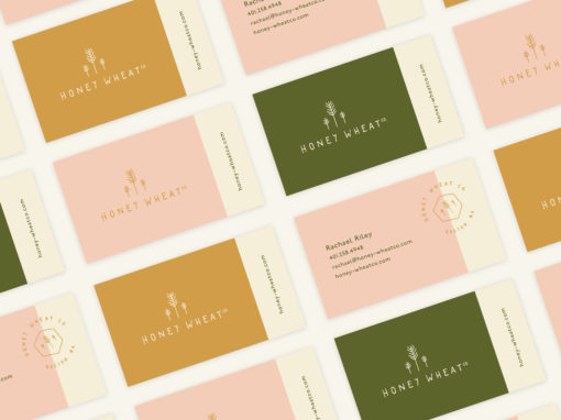
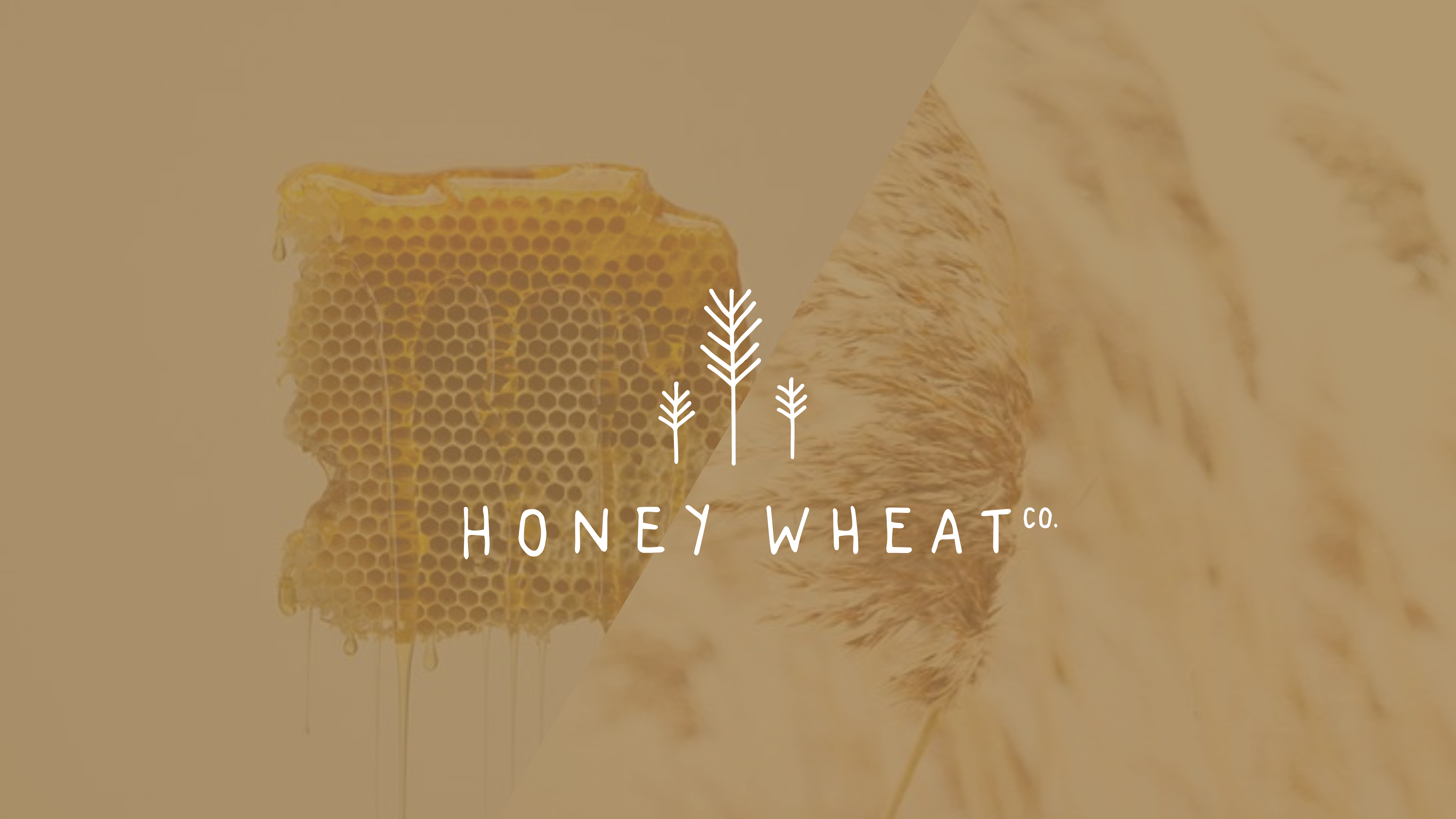
HONEY WHEAT CO.
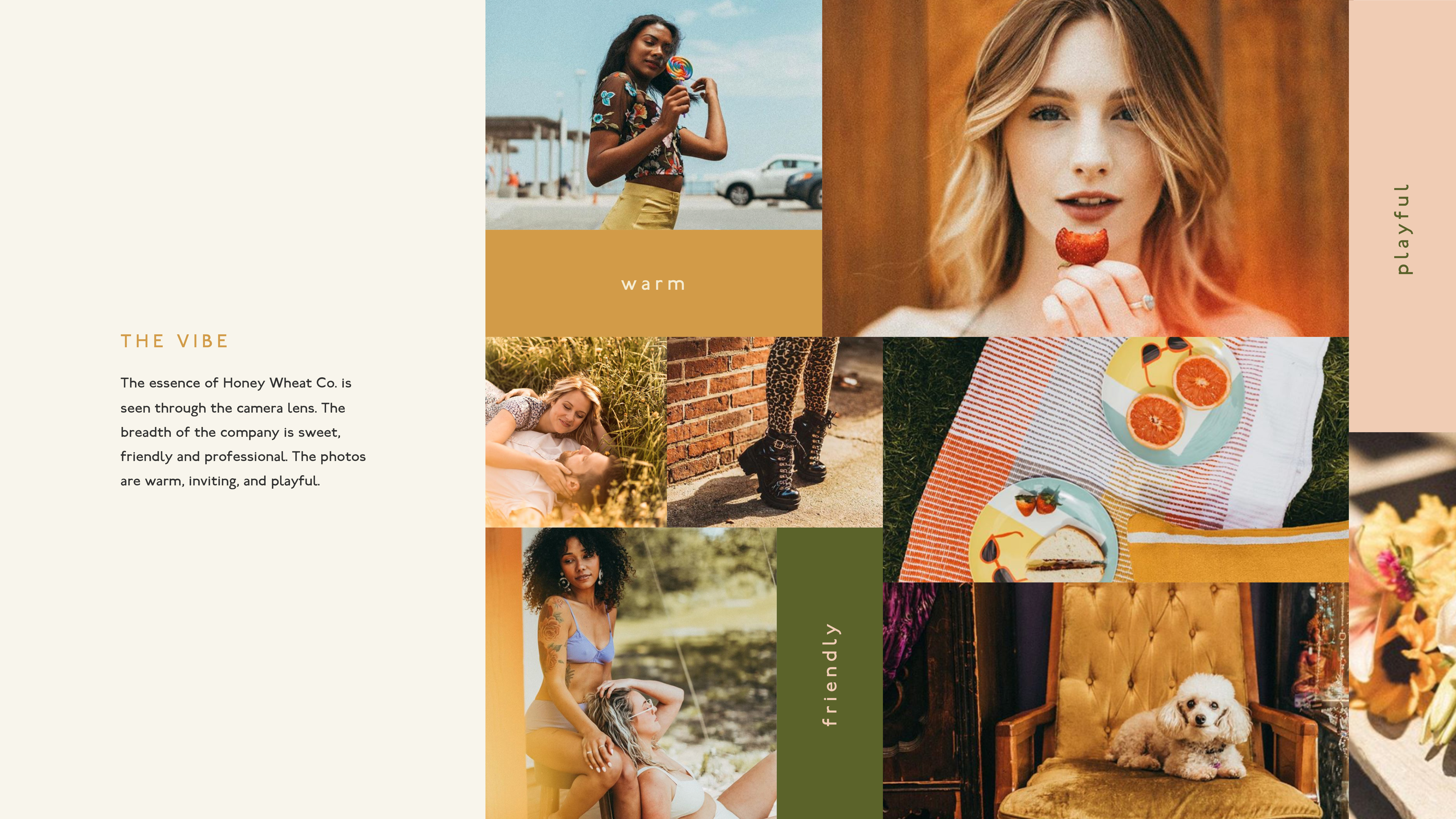
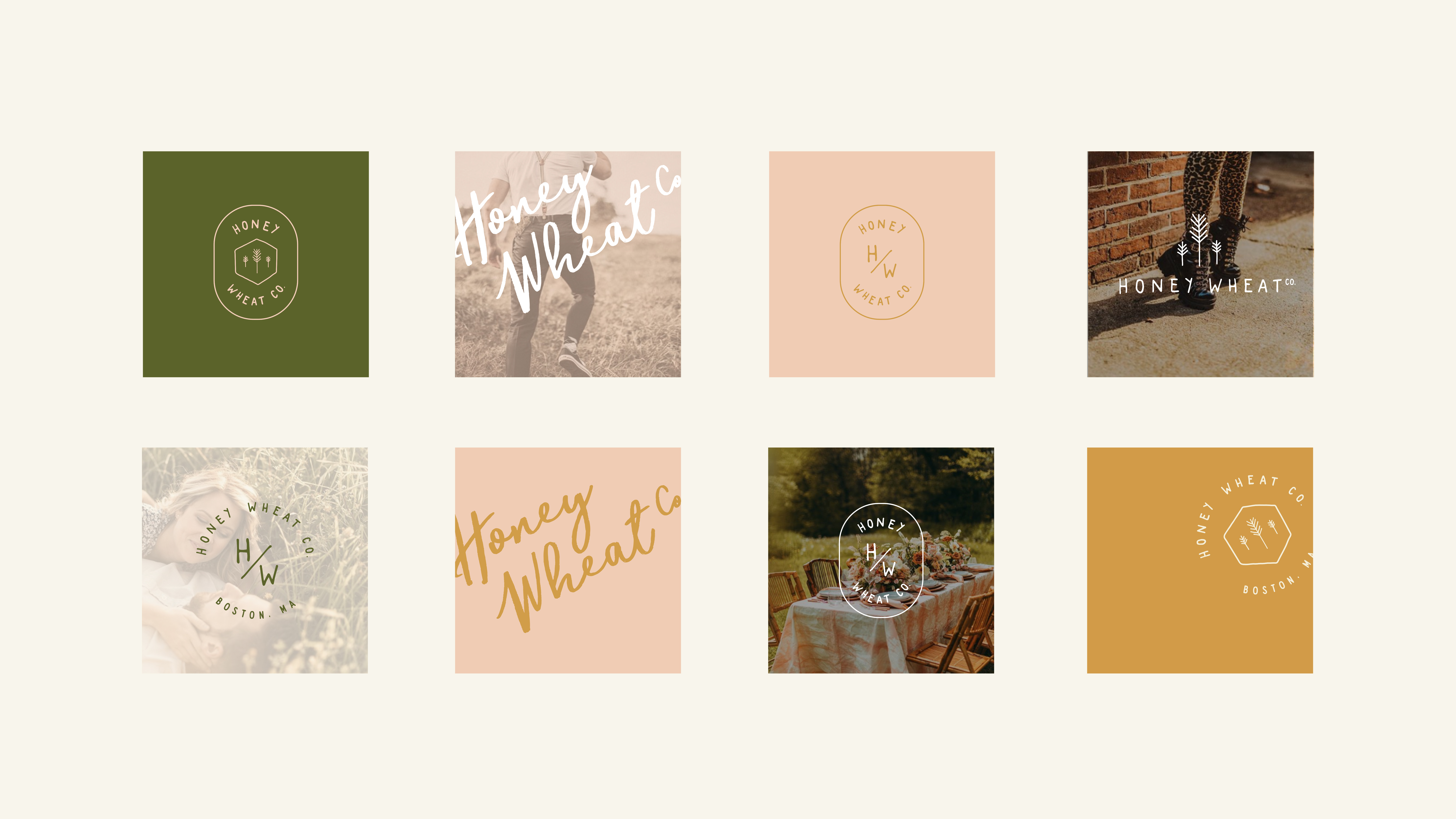
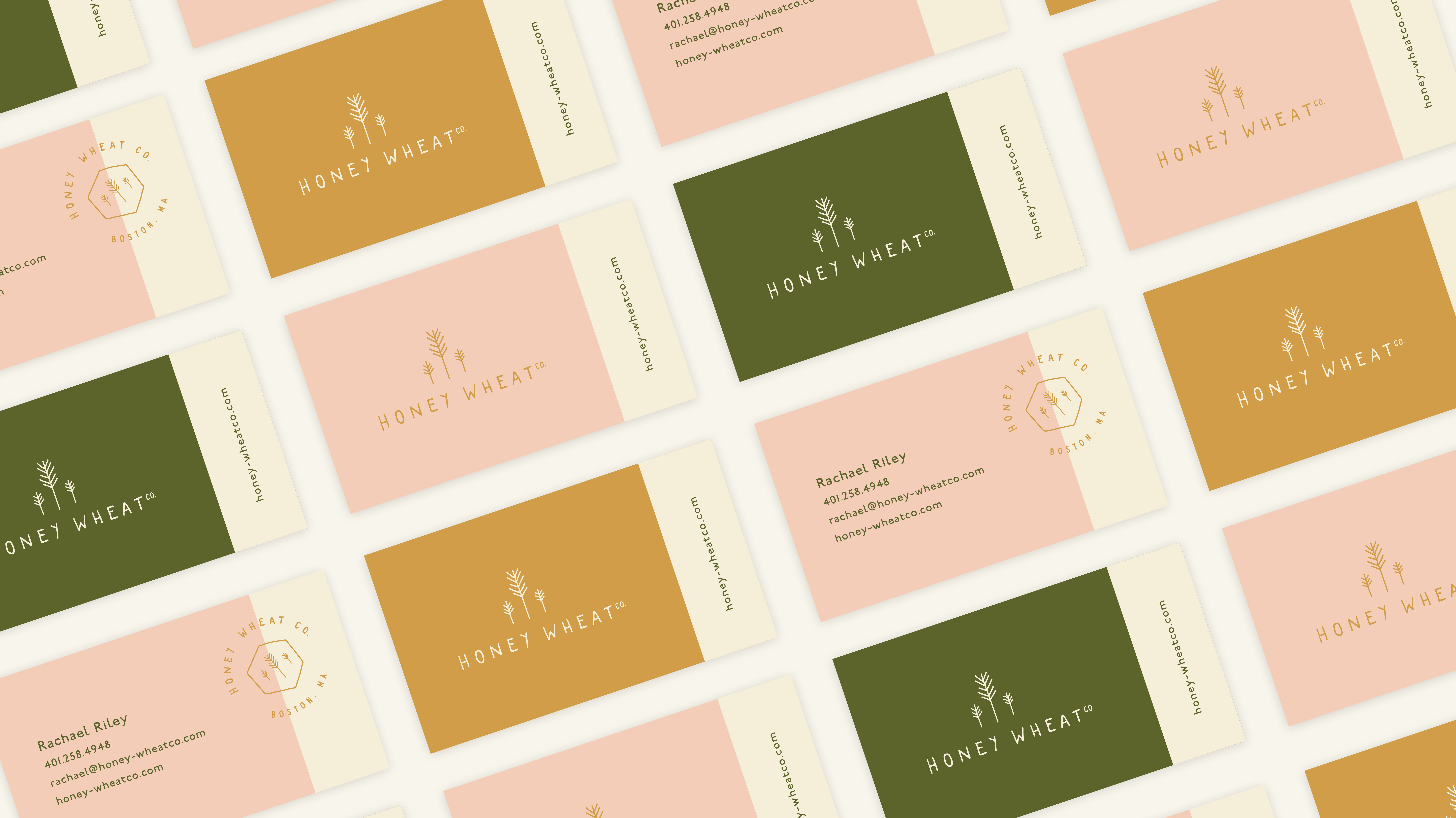
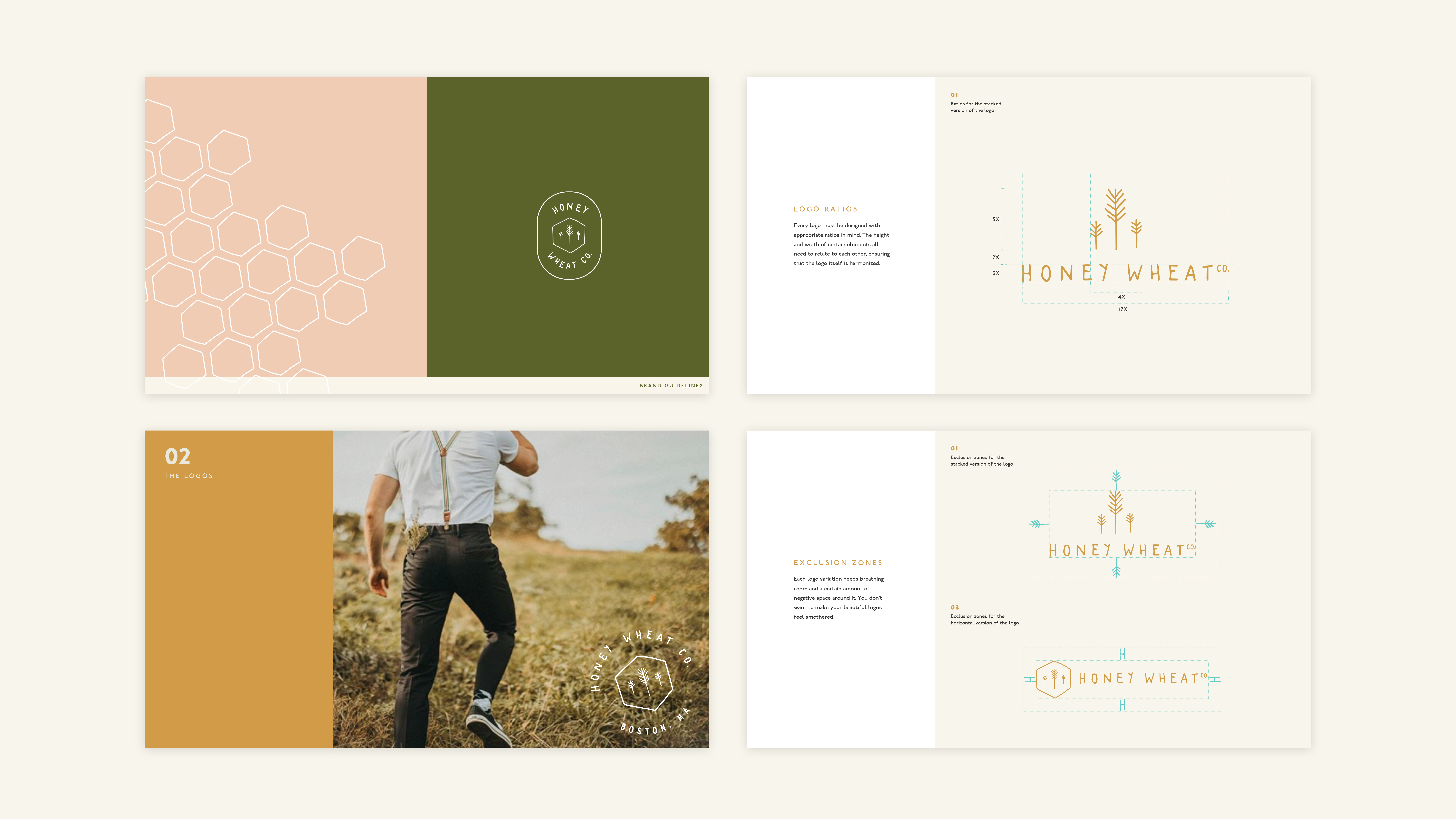
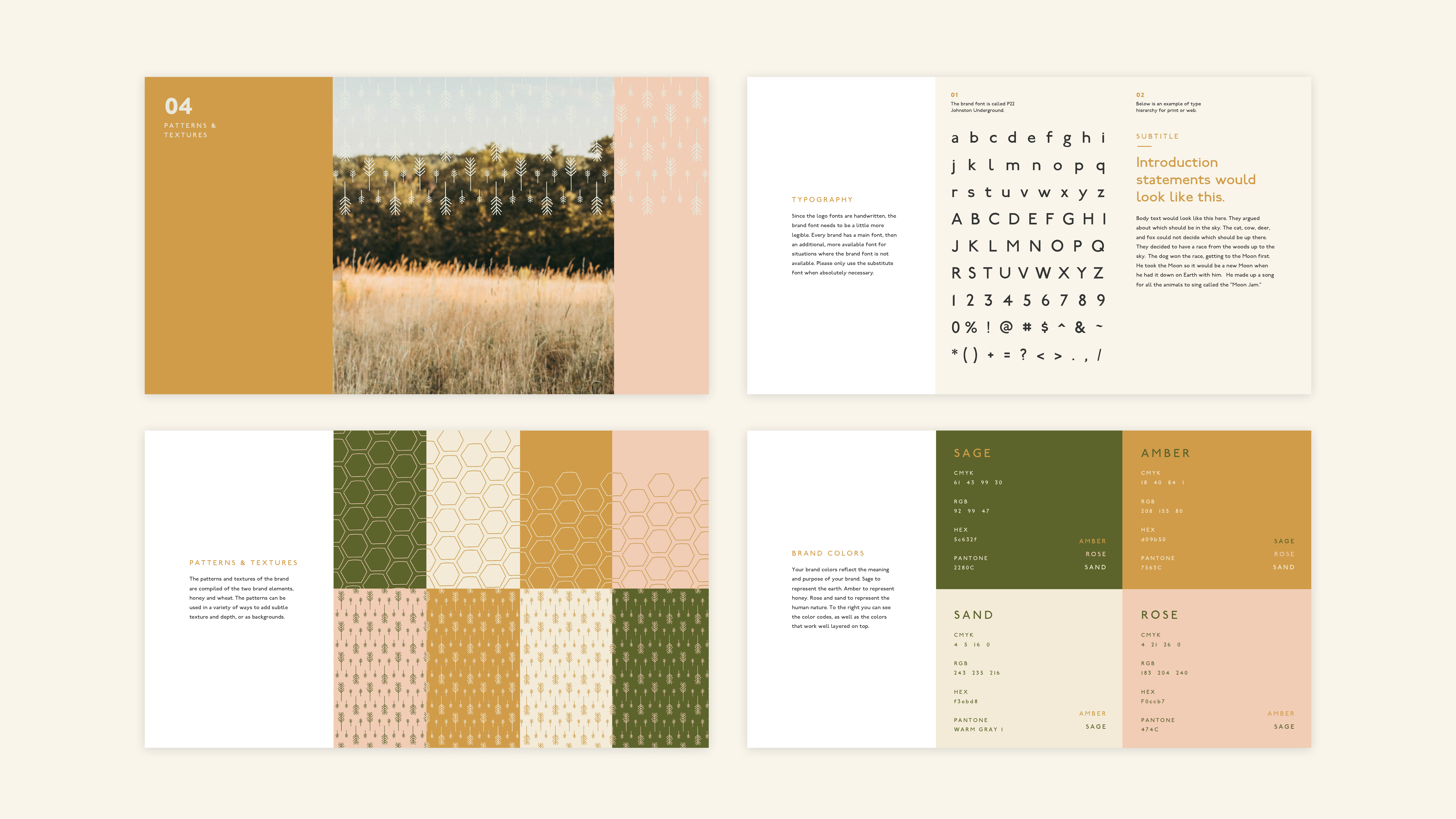
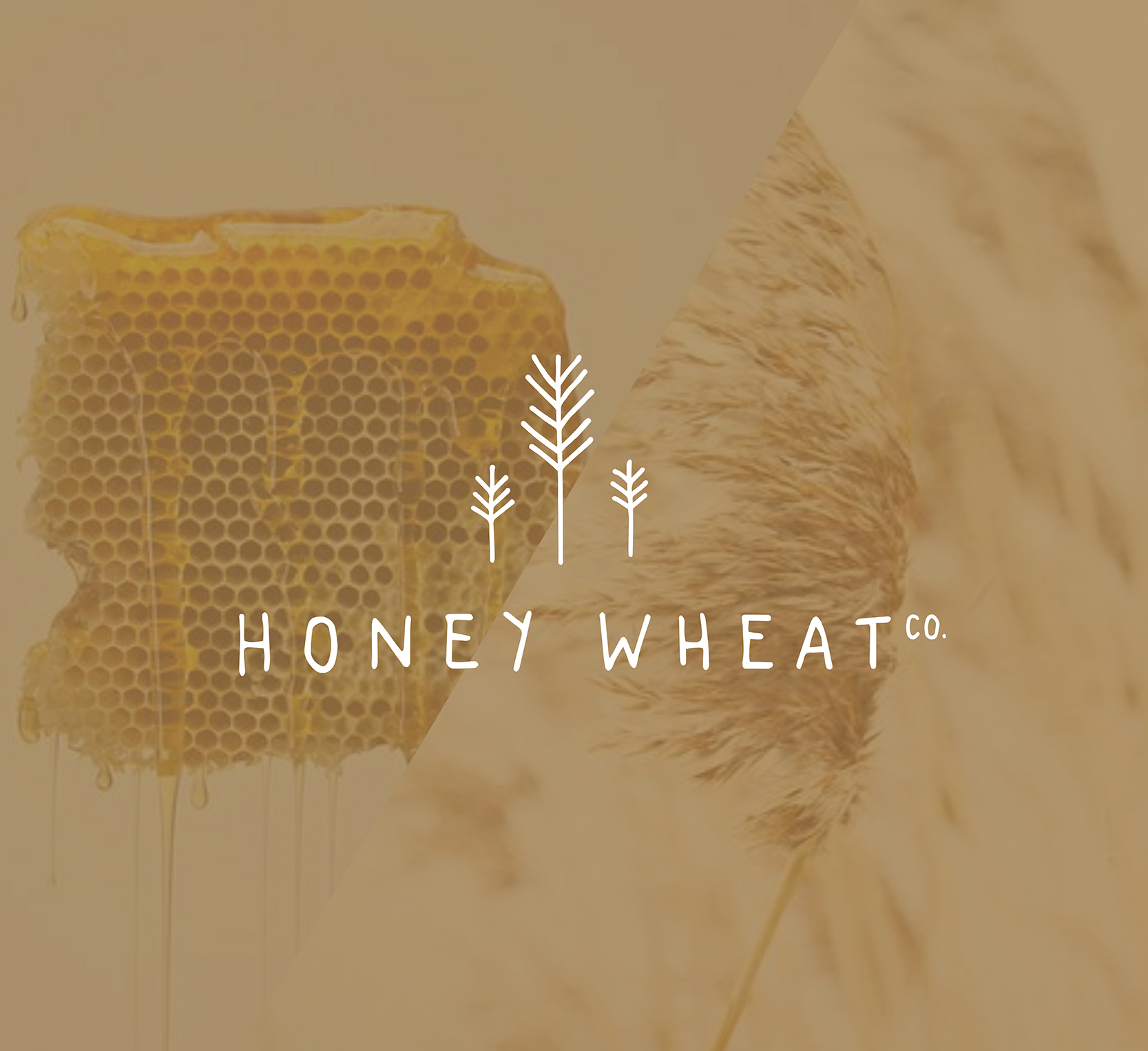
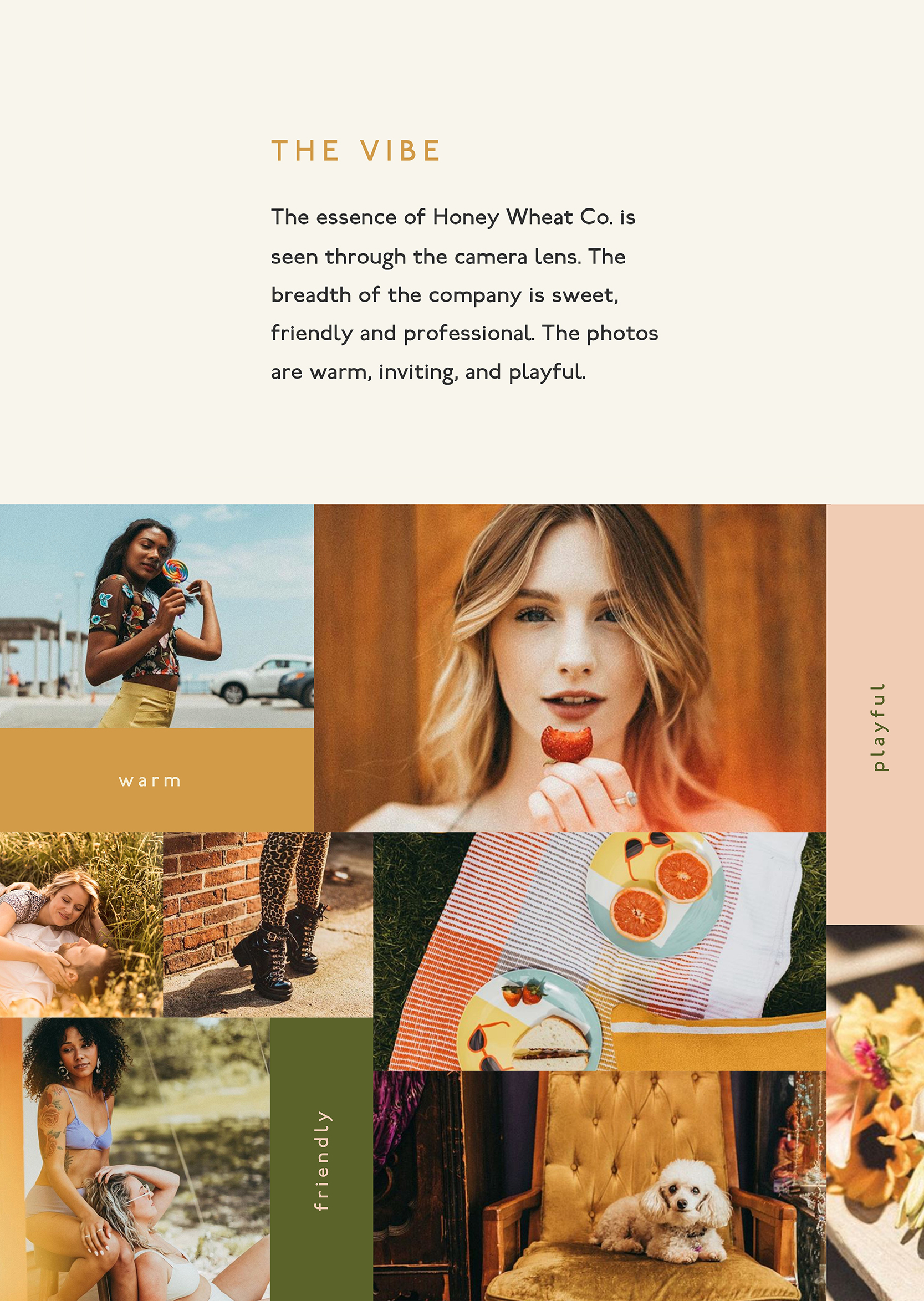
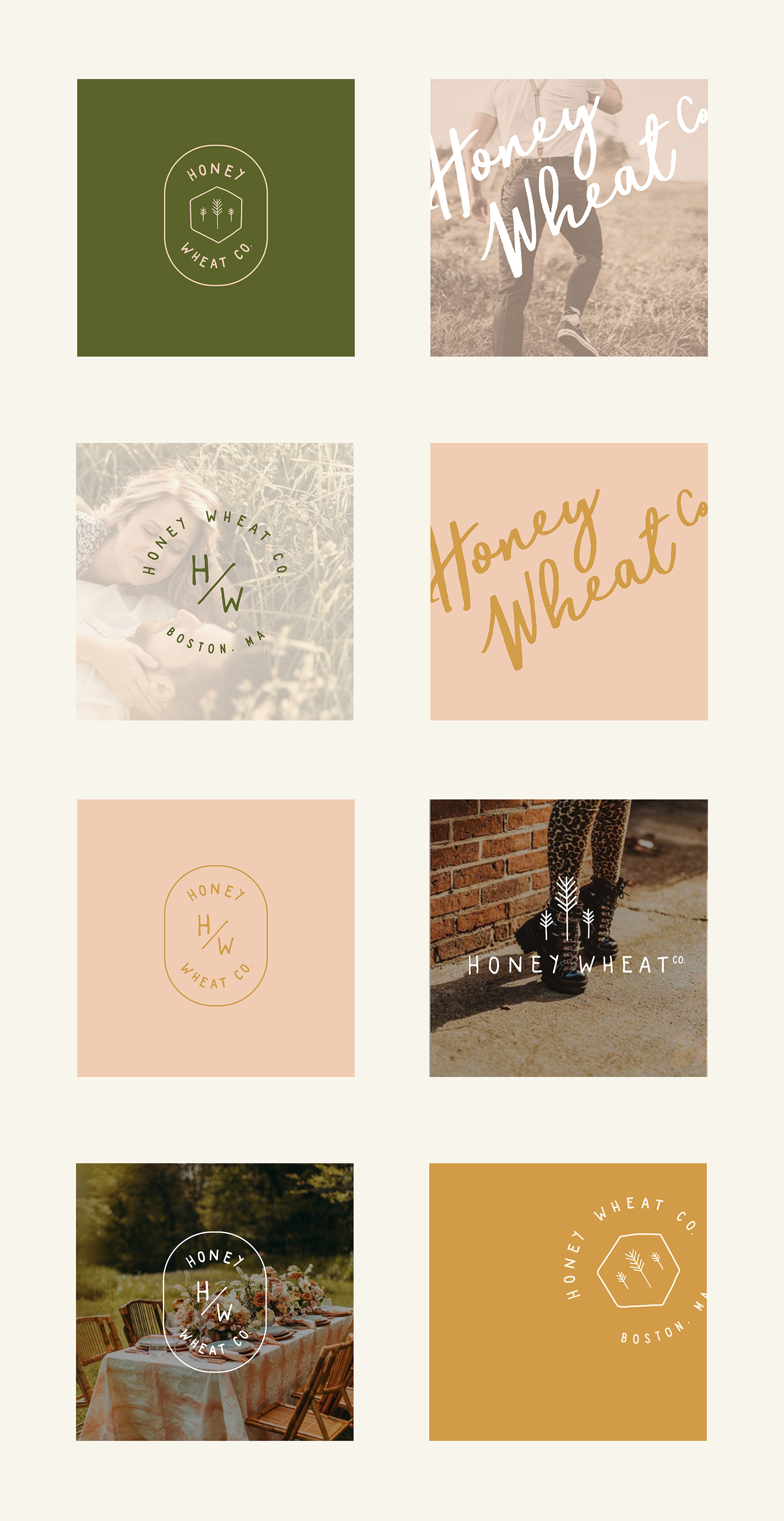
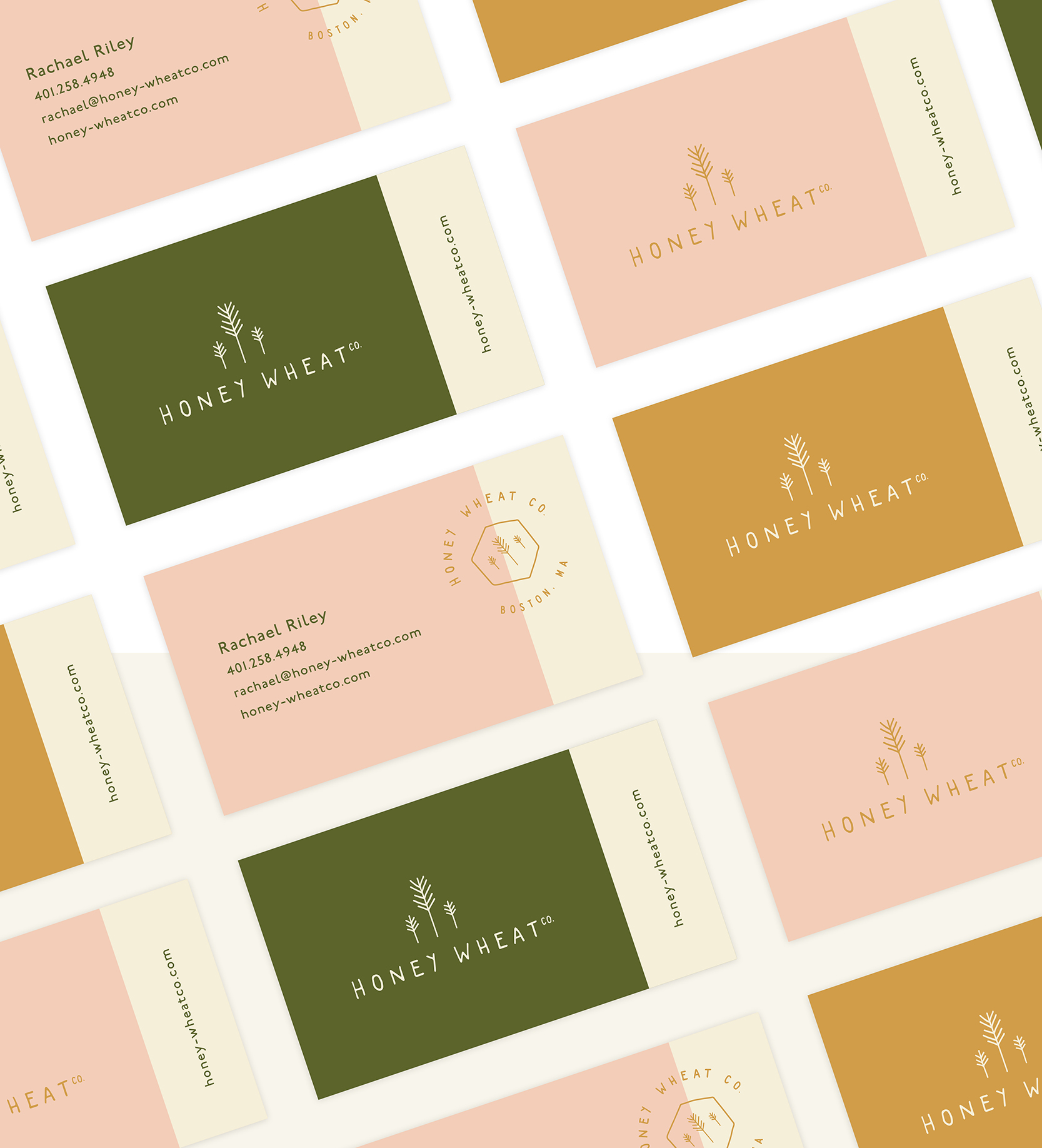
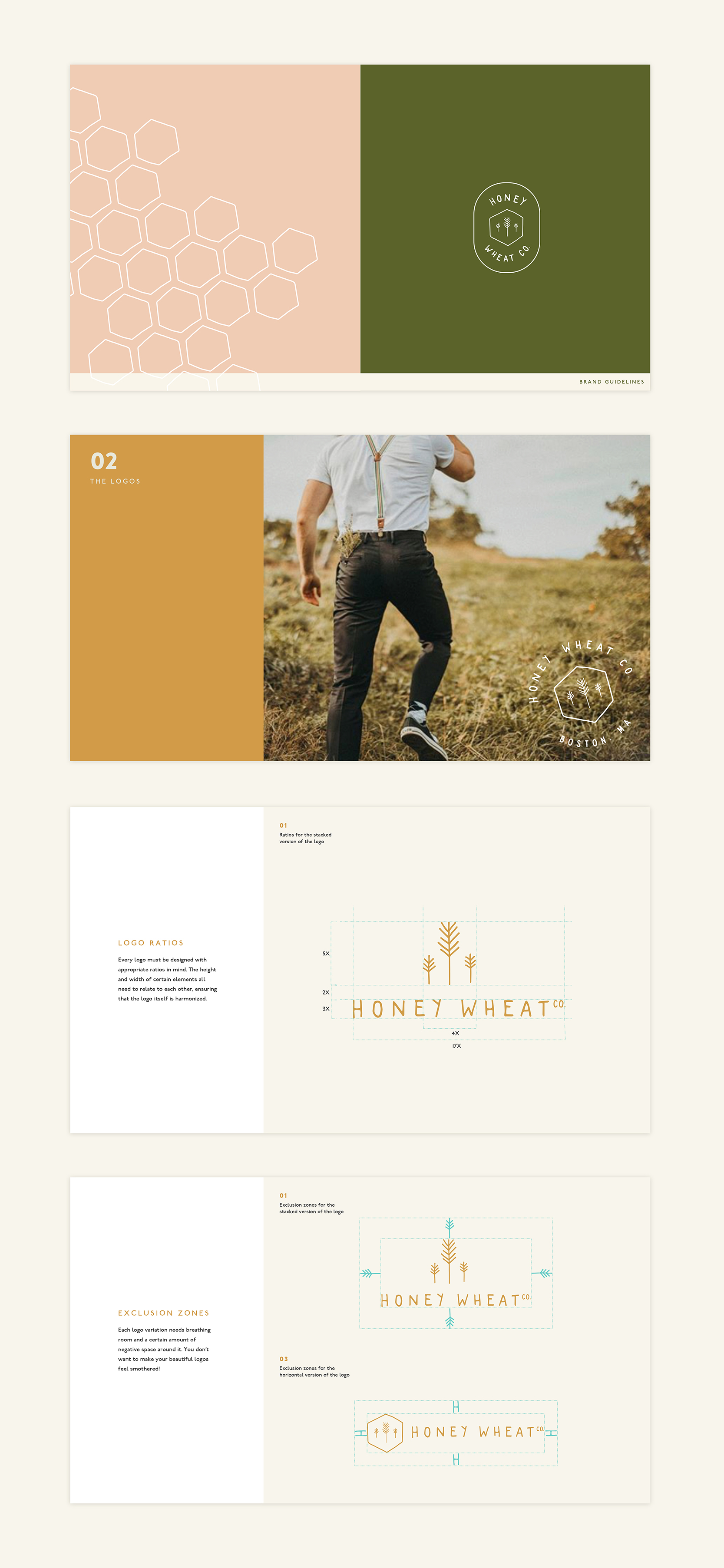
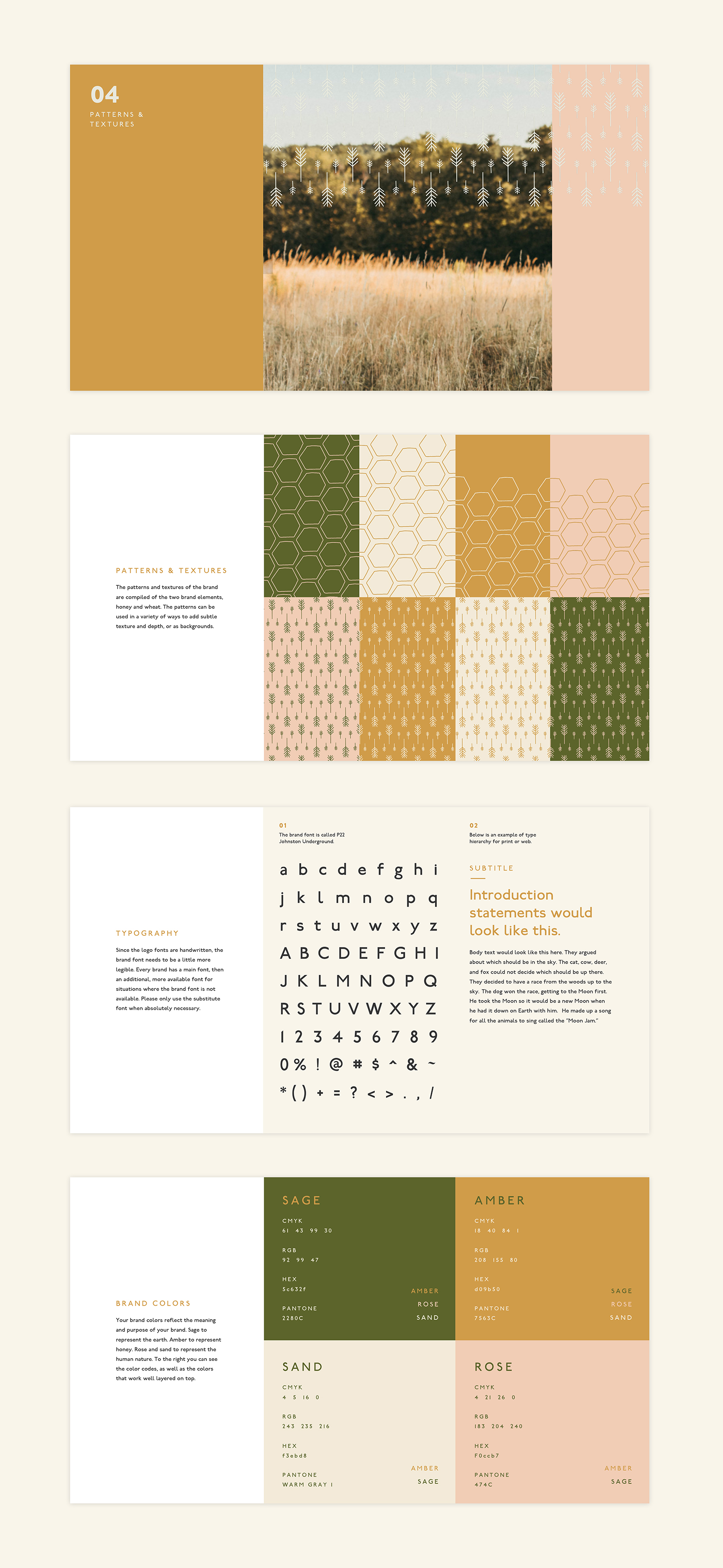
Honey Wheat Co. is a Boston-based photography company that specializes in wedding and portrait photography, all spearheaded by the talented Rachael Riley. Rachael wanted a new look for her brand, something that spoke to the way she works with her clients, as well as embodied her core values. With the name Honey Wheat Co., we needed the logo to exemplify her humble and grounded nature, as well as the way she can capture the sweetest moments in life. I developed a brand family that combined a hand-drawn honey and wheat symbol and hand-lettered brand typography. The brand came full-circle with a soft color palette to compliment the brand marks. The final package included primary logos, secondary logos, brand development, brand guideline development, and business card designs.
(please note that all photography used in this project is owned solely by Honey Wheat Co. and Rachael Riley)
design & art direction // kayla speed
LET'S WORK TOGETHER